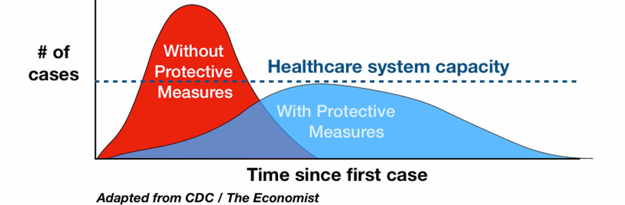
By now, you have probably seen the chart that shows the load on the healthcare system over time. The chart shows the number of critical patients that goes far above the limit of what the healthcare system can tackle. The chart suggests that when we slow the spread of the virus, we stretch out the timeline, and the peak of the curve goes below the limit.
This chart is at best omitting a key element, and at worst is an intentional misrepresentation. Here’s why: because of the timeline that most people assume in this chart. Most of the people I have spoken to believe that the timeline in this chart is weeks.
Let’s do a quick reality check: the transmission models predict that 60% – 70% of the population will contract the virus, regardless of how quickly it spreads. When it’s all over, 2/3 of us will be infected. Out of the people who contract it, 5% will need ICU care and a ventilator. In the US, this means around 10 million people will need a ventilator. The average critical care period is half a week. The US has approximately 150,000 ventilators. Now do the math!
Here’s the answer: it would take approximately a year for the critical patients to get treated and to get this to a situation where the health care system can cope. That’s what stretching the timeline, and “flattening the curve” means. The good news: there is hope that a vaccine might shorten this to 18 – 24 months (and this is assuming a vaccine with an unprecedented efficacy of 100% and no side effects).
But even then, I can’t see us as a society being able or being willing to sustain the changes in our lives that we are currently heading for. The impact on the economy, on our personal finances, on our public and private lives, and on the dreams and ideas we have for how we want to live our lives are simply too significant for such a long period.
There’s no way we can tackle this with the current strategies that are being (publicly) discussed.
What can we do?
At this point, ask critical questions and get those in leadership roles to be as transparent as possible. Trust matters in these situations, and it can be eroded quickly with incomplete and misleading information.
Don’t accept all the answers that are presented – even when they come from scientists. Trust your analytical capabilities. When someone with a Ph.D. says something (instead of a politician), it may sound more convincing at first, but in the end, it doesn’t mean it’s complete or correct information. It’s possible to spin numbers, charts, and animations just as easily as words.
Let me know your thoughts. I know you’re a community of people who can “think on their feet.” I’m already looking forward to your comments…